Minimum Wage Data Project
A Tableau Exercise In Creating Map/Geospatial Visualization For Analysis
For this project I found a free dataset of minimum wages from all 50 states from the years 1968-2020. With this impressive dataset I wanted to create some interesting visualiztions that could help me better analyze how the U.S. federal and state minimum wages were changing over time and what impacts that could have on the U.S economy and its citizens.
Here are some of the key questions that I wanted to answer with my analysis.
- Are certain areas of the U.S. more likely to have higher minimum wages?
- What states have the highest minimum wages today?
- What are some trends in individual states wages over time?
- What trends does the federal minimum wage show over time?
It is also worth noting that this analysis has data demonstrating minimum wages and their relation to the federal minimum wage. What I mean by this is that sometimes the state minimum wage is listed as $0, and when this occurs it means that the state simply had no minimum and used the federal minimum wage. There are also columns showing the modern inflation adjusted value of a wage for a given year (i.e. 1968's value recalculated for an equivalent 2020 value).
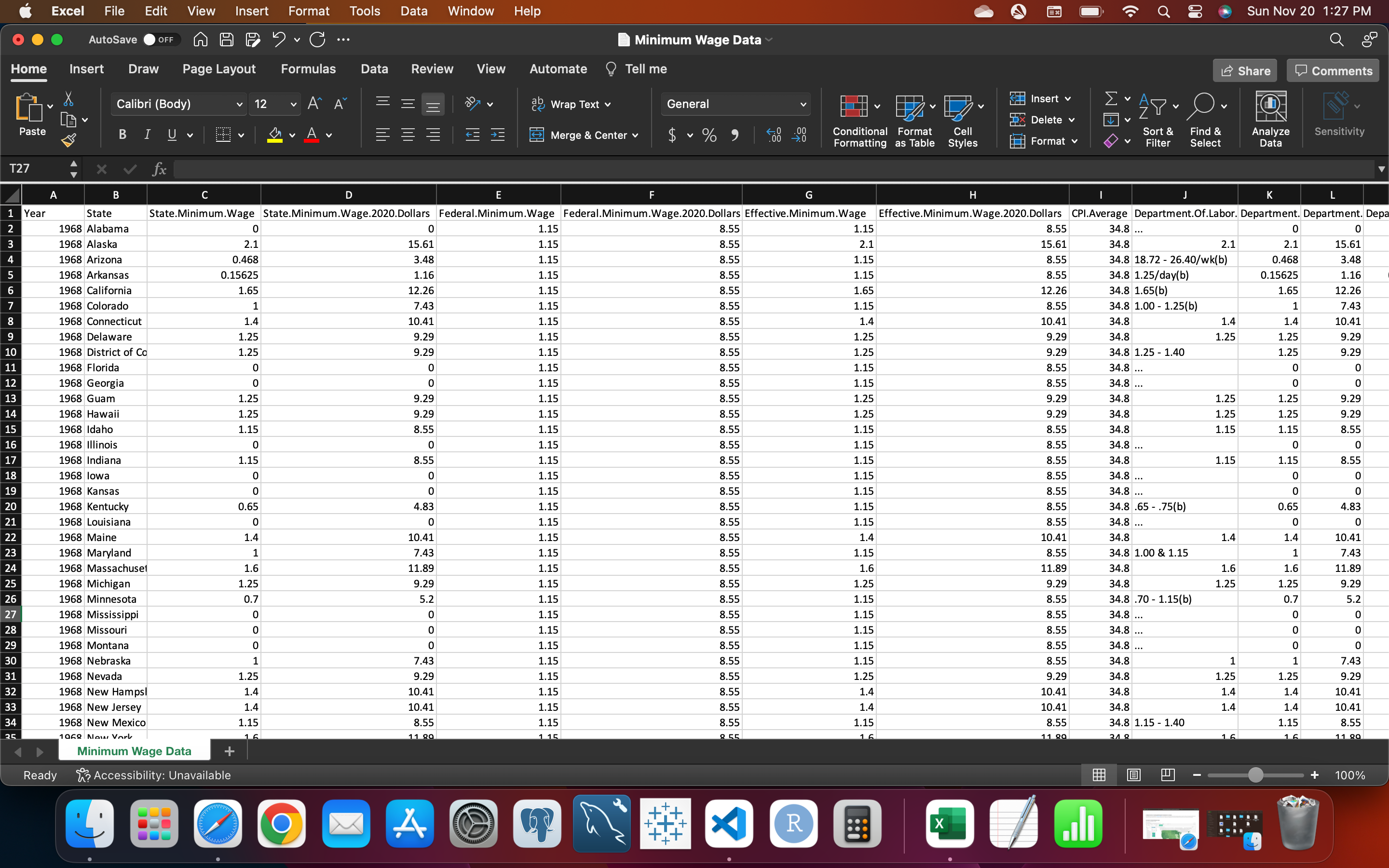
The Inital Pre-Cleaned Dataset In Excel.
The data came pre-cleaned and ready to use in a cvv file that I easily loaded into my Tableau workspace. The most notable columns (A-F) included in my analysis were the year, state, the state minimum wage for that year, the state minimum wage's modern value (2020), the federal minimum wage for that year, and the federal minimum wage's modern value (2020).
Interactable Map of State Minimum Wages Over Time.
Since I had some Geospatial data from the state column, I thought that one of the most useful visualiztions I could make would be a map of the states filtered by any single year someone wanted to analyze wages for. Hovering over a state allows someone to view all its minimum wage data for that year with the federal data listed as well. This visualization is particularly useful if we want to do comparisons between states and/or federal minimum wages within seconds.
The map displays and color codes each states' minimum wage for that year (again, a wage of 0 means they used the federal minimum wage as their state minimum wage). That allowed me to instantly compare wages with all of the states. From there I could just hover over any state to view the federal wage to compare it as well. The modern 2020 value also gives us context as to the value of what the wages had during the listed year.
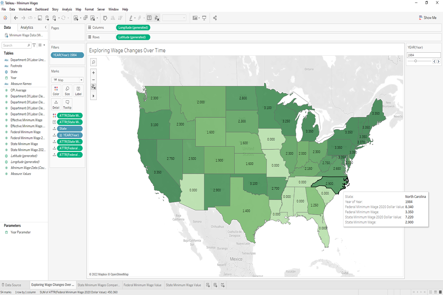
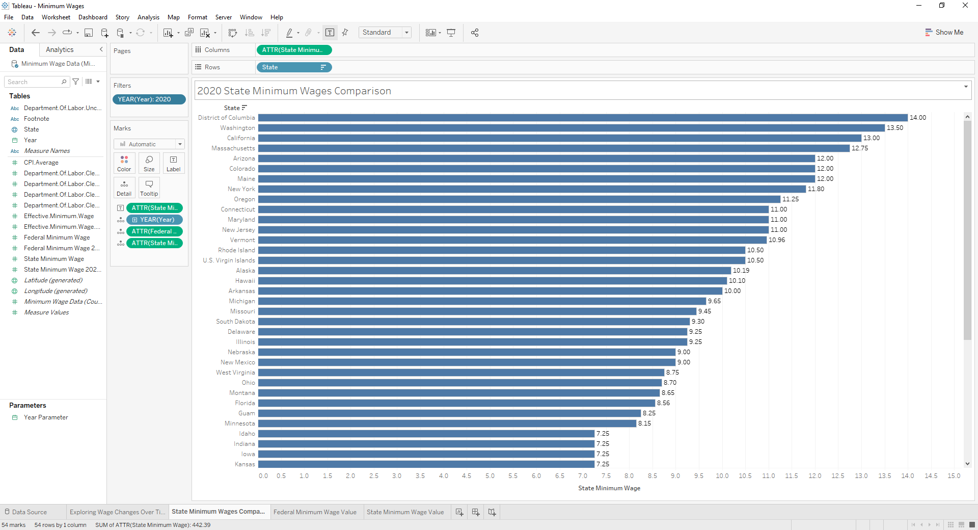
Chart Comparing Different State Wages in a specific year (i.e., 2020).
I made this chart because I believed it would be easier to do multiple/many state comparisons for any year that needed to be analyzed. While the map is impressive and good for overview and individual state comparisons, this chart allows us to quickly view and compare large blocks of states’ wages (like the top and bottom ten).
Here I was also able to answer the first two of my key questions as well, being which states/areas have the highest minimum wages as of when this analysis was conducted (in 2020). The top five states were District of Columbia ($14.00/hr), Washington ($13.50/hr), California ($13.00/hr), Massachusetts ($12.75/hr), and tied at fifth place were Arizona, Colorado, and Maine ($12.00/hr). Some of these would reflect any hypothesized guesses (The Capital, Hollywood and Big Tech, Boston, etc.). However, interestingly the data suggests that some unlikely states have a need/desire for a higher minimum wage The fact that Arizona and Colorado hav a higher minimum then New York and commerce hubs like Florida, Texas, and Illinois (Chicago) are lower than states like the U.S. Virgin Islands, Alaska, and South Dakota gives cause to investigate why that might be the case.
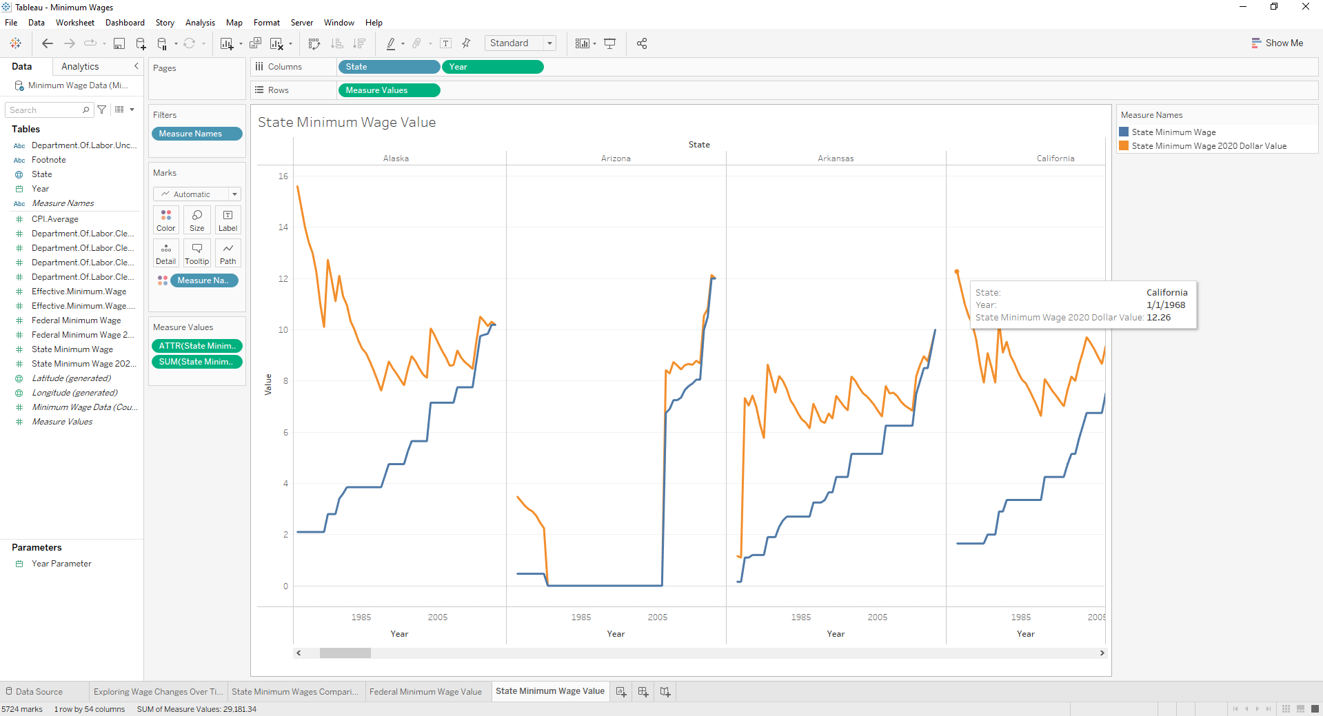
Displaying Data For Each Individual States' Wages Over Time
This particular visualization was made to address the third question of my analysis (what are some trends in certain state wages over time). While there are entirely too many states to display all at once I thought that this view would help give a general idea of what information could be obtained regarding some trends. There are two measures being used on the chart, being State Minimum Wage (the dark line) compared to that wages value in 2020 (bright line). The data suggests that the overall value of each states wages are decreasing over time. Since the minimum wage value increases but the 2020 value of the wage is not rising at the same time, we can conclude that not only is inflation causing a decrease in the overall value of the currency, but the minimum wages are not being raised enough in response to the decrease in value. This likely results in workers that make minimum wage being able to afford much less than they could in previous years when their wage had more market value.
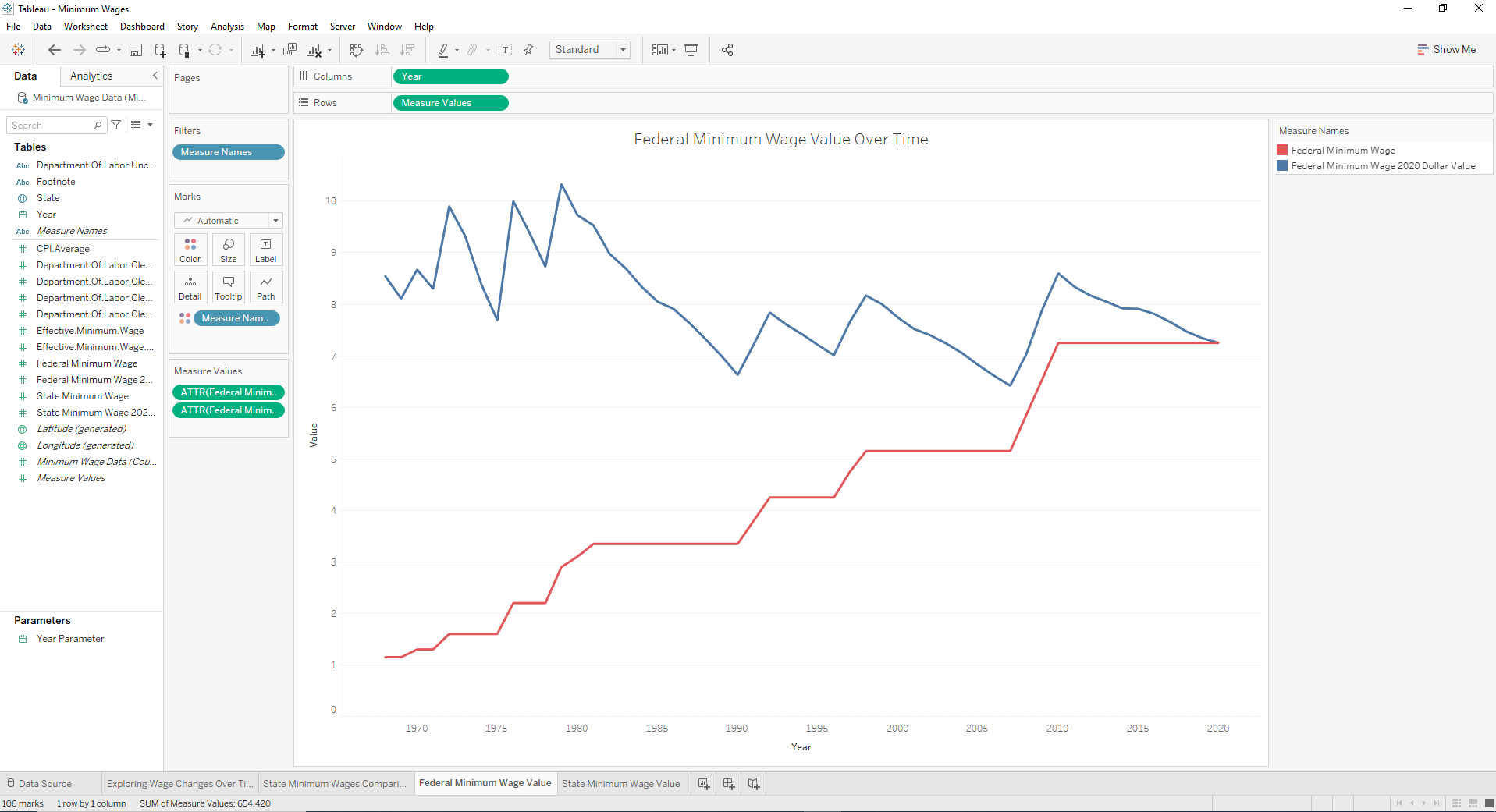
Investigating Federal Minimum Wages Change in Value Over Time.
This last chart was created to answer the final question of my analysis, being what trends does the federal minimum wage show over time? A simple line graph displaying the federal minimum wages value over time while being compared to its modern value (in 2020) allows us to quickly and conveniently conduct an analysis. Results were similar to the same trends found in the state wages. The federal minimum wage was found to be decreasing in value over time, without proper corrections to market inflation. Here we can see that the while the federal wage would increase $1-2 every 5-10 years, the value of its spending power was either decreasing or stagnant during those times. As stated previously, this likely impacts consumers making these wages by making them experience more financial distress, lack of economic mobility, and creates an increasing inability to spend their cash in the economy.
Concluding Thoughts
This project was one of the more in depth analysis I was able to do with a particular dataset. The story that the data is able to tell about the US working economy over a span of 52 years is incredible. The visualizations that were made from it make it easier to form hypothesis, gain insights, and drive decision making. By viewing them we can learn about how workers wages might contribute to the daily living standard of US citizens over time, wages impact performance of the economy as a whole, and how to improve the bottom part of our economic structure.
Of course there are always more questions to ask and data to find the answer with. It would be interesting to pair this with other related datasets such as inflation spreadsheets, economic and industry data, and more to see if any more insight to these issues can be gained. I hope you enjoyed reading and viewing this project as it was incredibly fun for me to make. I look forward to investigating more topics like this in the future with even more robust datasets and tools to dig through them with.